Moodle Activities - Main page
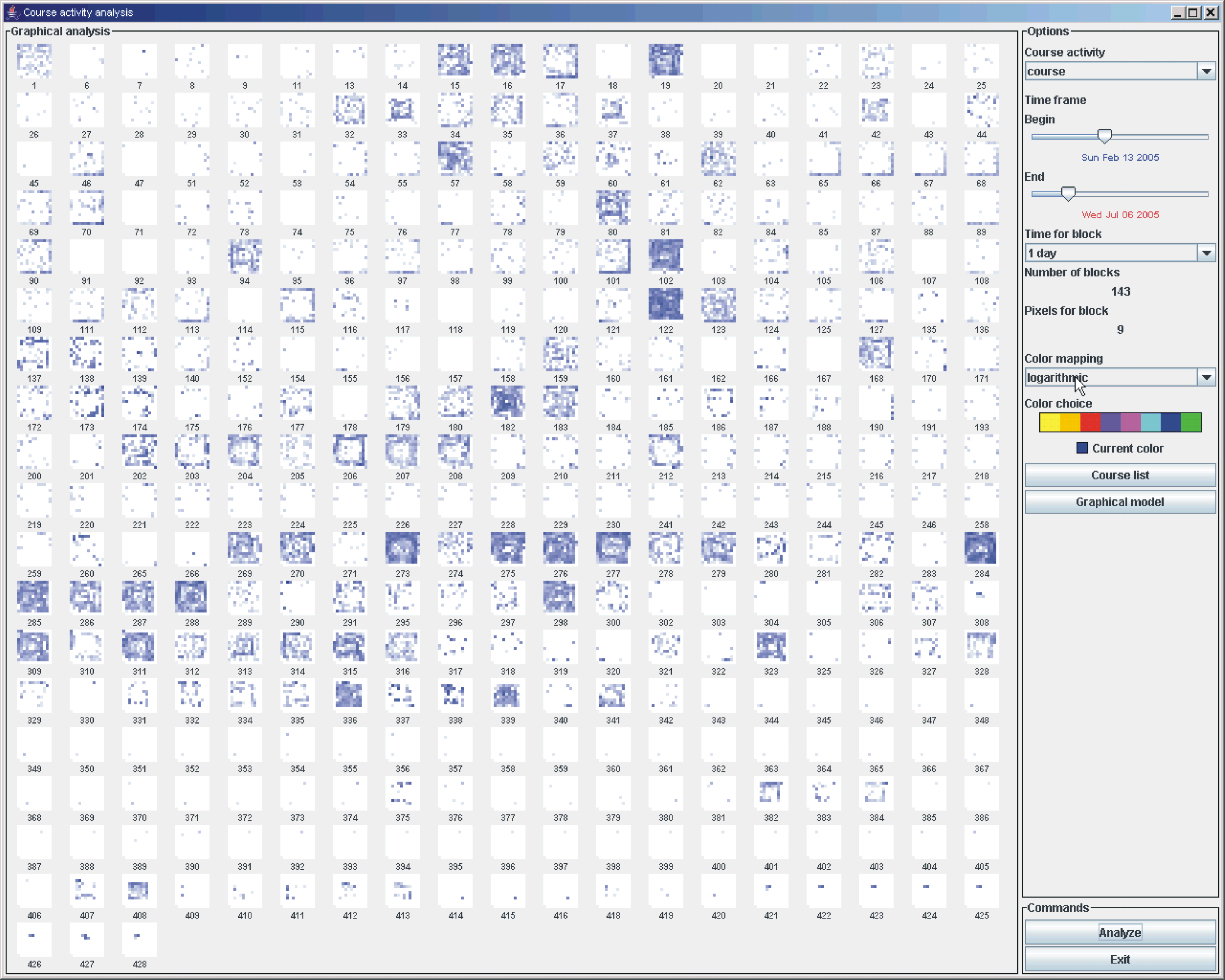 |
The figure illustrates the main GUI of this application. As we can see, there are 2 main areas in the user interface. The panel on the right contains GUI components to receive the interactions from the user. In particular, the user can select begin and end of the time range, the granularity of the time discretization, the type of mapping (linear, logarithmic), and finally the color. The main panel on the left is dedicated to store the matrix of subwindows. Each subwindow represents a different course. A pixel-oriented visualization technique is used to represent the usage of the module in a particular course. Pixels are positioned in a spiral order, starting from the center and heading outward. A range of time is converted in a discrete order and mapped into the distance of the pixels from the center. The color (in particular, the saturation) of the pixels is mapped with the usage of the module made in that particular slice of time (max usage = max saturation, no usage = no saturation). The result is a matrix of spirals that help the administrator of the platform to make sense of the usage of a module in each course and compare the usage in different courses. |